UX/UI for Peltarion's AI documentation site Knowledge center
2019-20
This was part of my work creating UX, strategy and design for the company’s website and beyond. The use case I’ve chosen to presented here will show the documentation part of the website, helping the platform users understand how to create artificial intelligence and deploying the trained models to their own applications.
Peltarion is building a browser based platform where the user of this deep learning tool can speed up their workflow. With an end-to-end solution, they can uploading their ‘big data’, build a DL model in a simplified GUI, evaluate the results and deploy the trained model to their own application. For the users to be able to navigate in the jungle of specialized expressions and the range of possibilities working with artificial intelligence, a comprehensive documentation chapter of the website was created.
Design principles
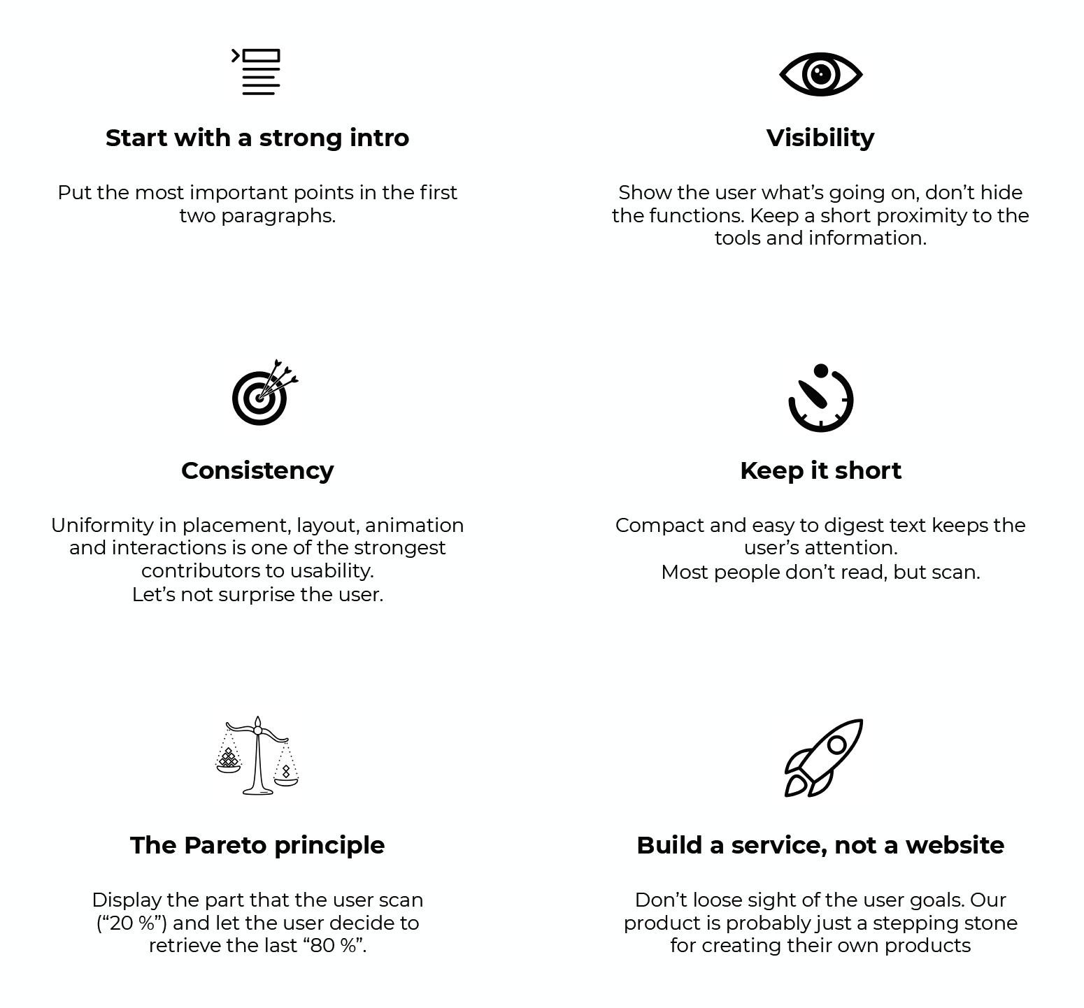
First off, as this was one of many projects we did, we already had a lot of research and understanding about the users. I decided to lay a foundation with some rules and pointers to how the design could be done. These design principles, as it's called, was created as a compass to keep track on the direction of the design decisions partly based on the industry standard Nielsen Norman heuristics. They aim to be a guideline to integrate UX as part of the copywriting itself.
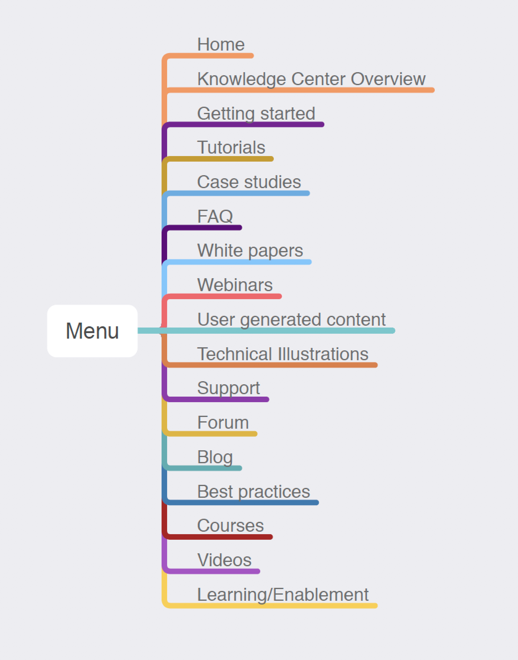
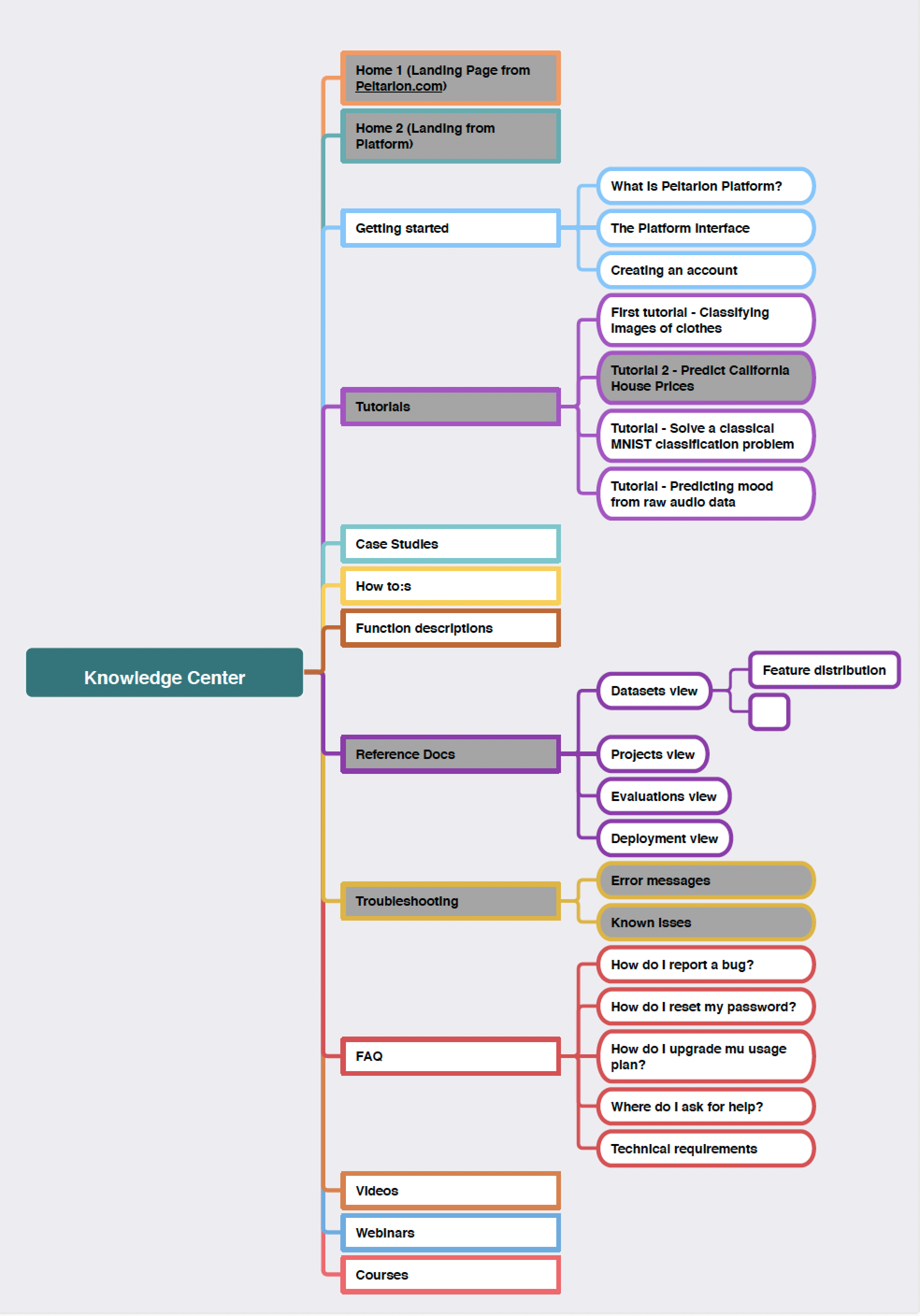
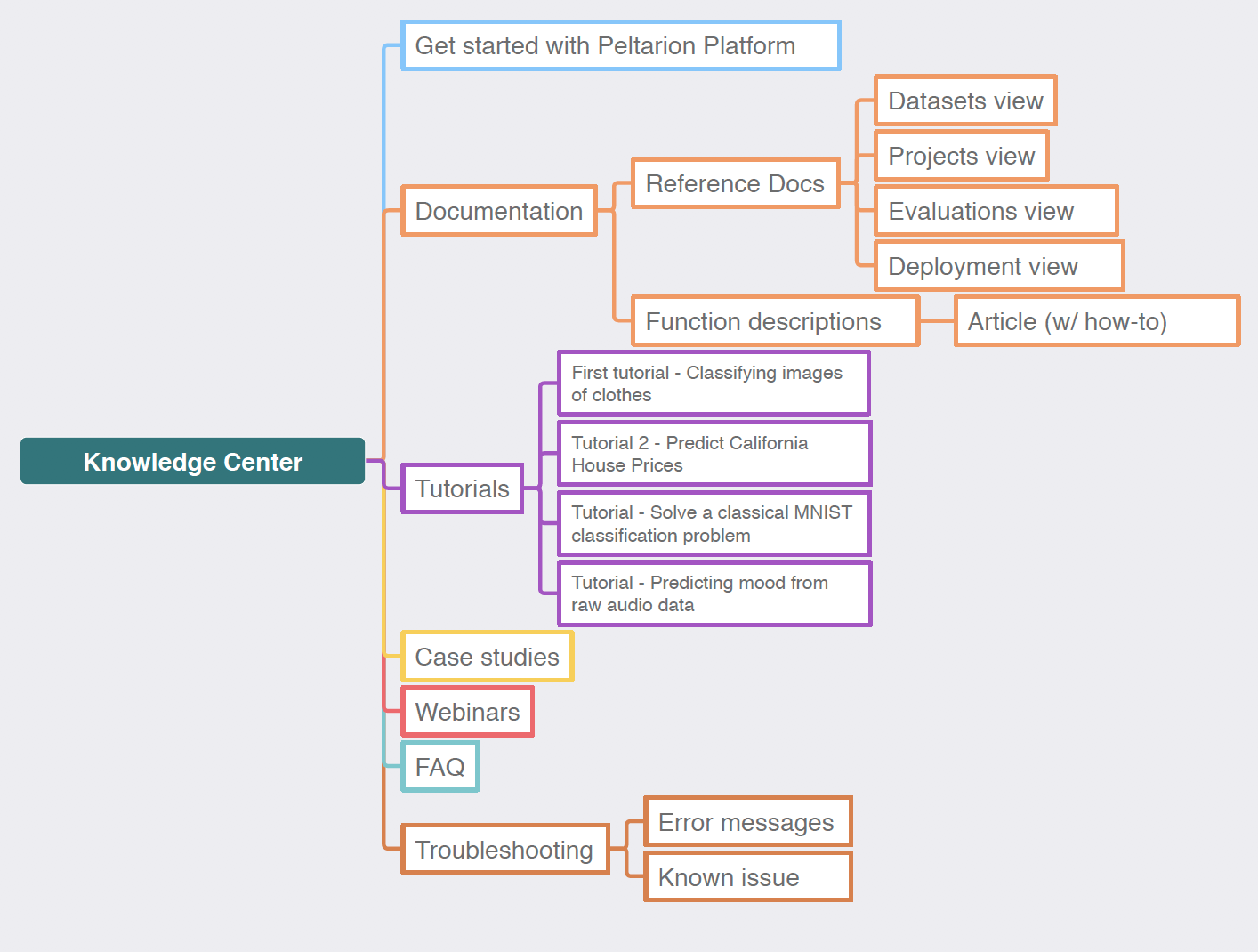
Iterations of the sitemap
Creating a sitemap is more than just sorting the names. Information architecture work involves the order and taxonomy of the items, but also making sure that it's not too general and not too niched. It's a palace. Take the help of users to ask them what they think and iterate on the first version you jotted down and go from there. A card sorting session or workshop is an easy way to let a user sort the names and section in the right order for them. They can also have a say in the actual naming in a session like that.
UI Elements & colors
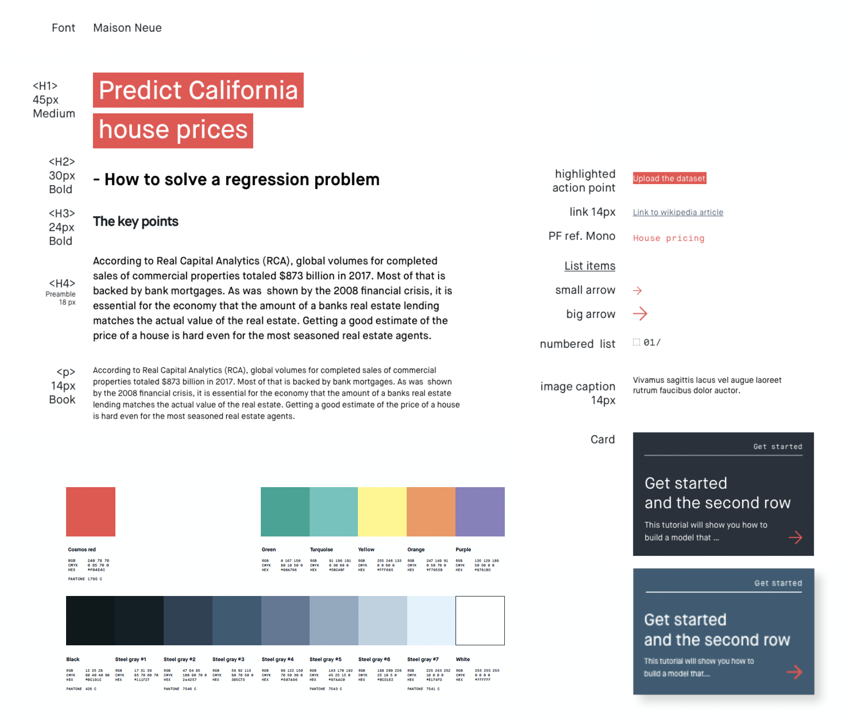
Creating a hierarchy for the font weights that explains to the reader what is what was one key element to this project. As the texts was usually long and very technical about a subject like artificial intelligence or deep learning, making room for white space and breathing between sections felt important. I really liked how we managed to keep from making the design dry and stiff to contrast the heavy subject matter.
Landing page
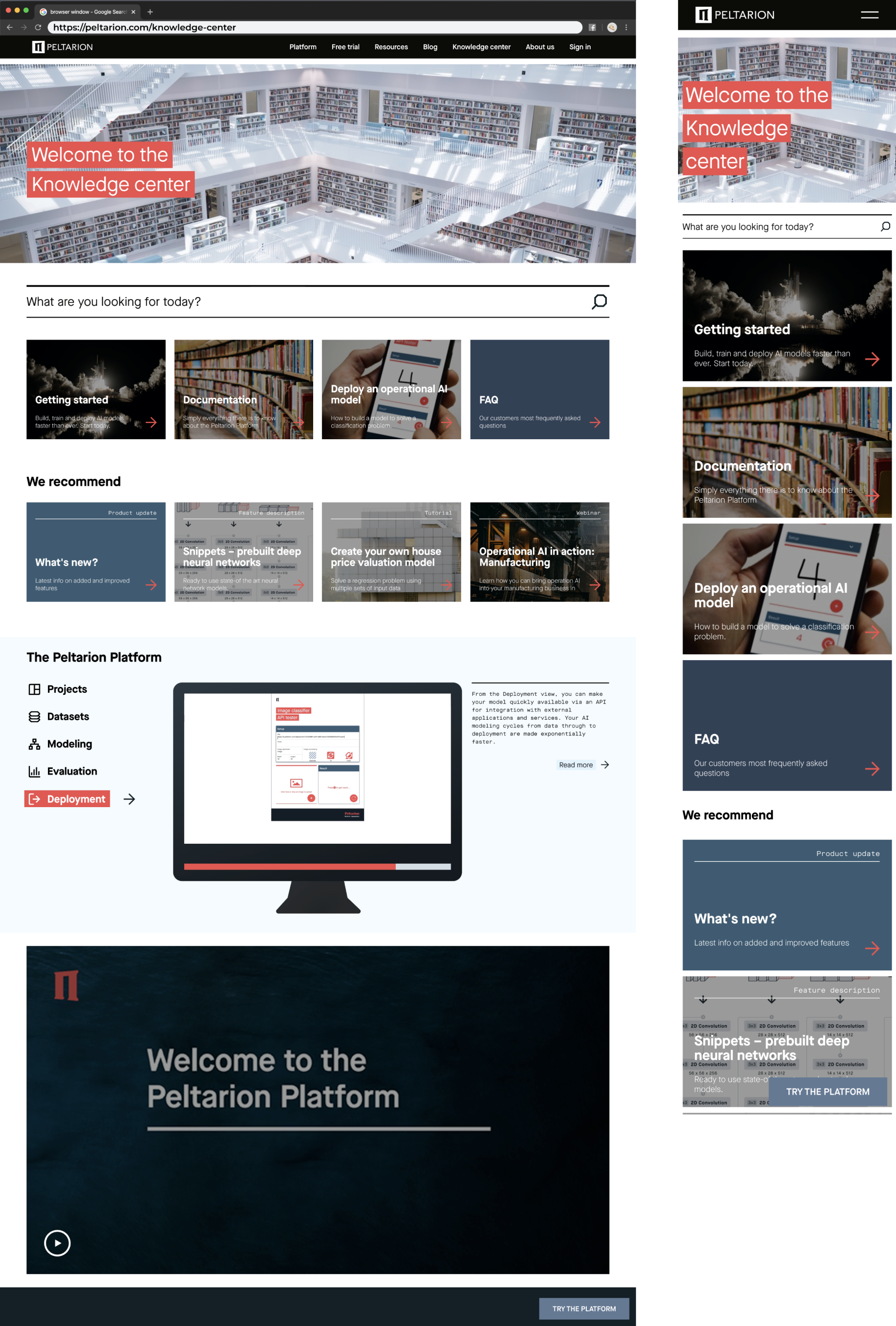
Assembling all the ideas, it ended up something like this. Understanding what most users are looking for determines the order of content. One thing that came up in the research phase was that a visual overview of the platform was missing - what can I expect after going through the process of signing up. What I came up with was a simple solution where all the main parts of the tool got a quick presentation in the mock-up screen with a progress bar showing when the "slides" will change and reveal the next topic. This also had an accompanying image caption with a link to read more next to it.
Article and menu
Once we had the typography set and font weights and sizes decided, the article was assembled in the way seen below. From a UX perspective it was important to think about things like readability and making it comfortable for the reader to read on a screen. There are guidelines for width of paragraphs and number of characters per row, which I integrated in this design.
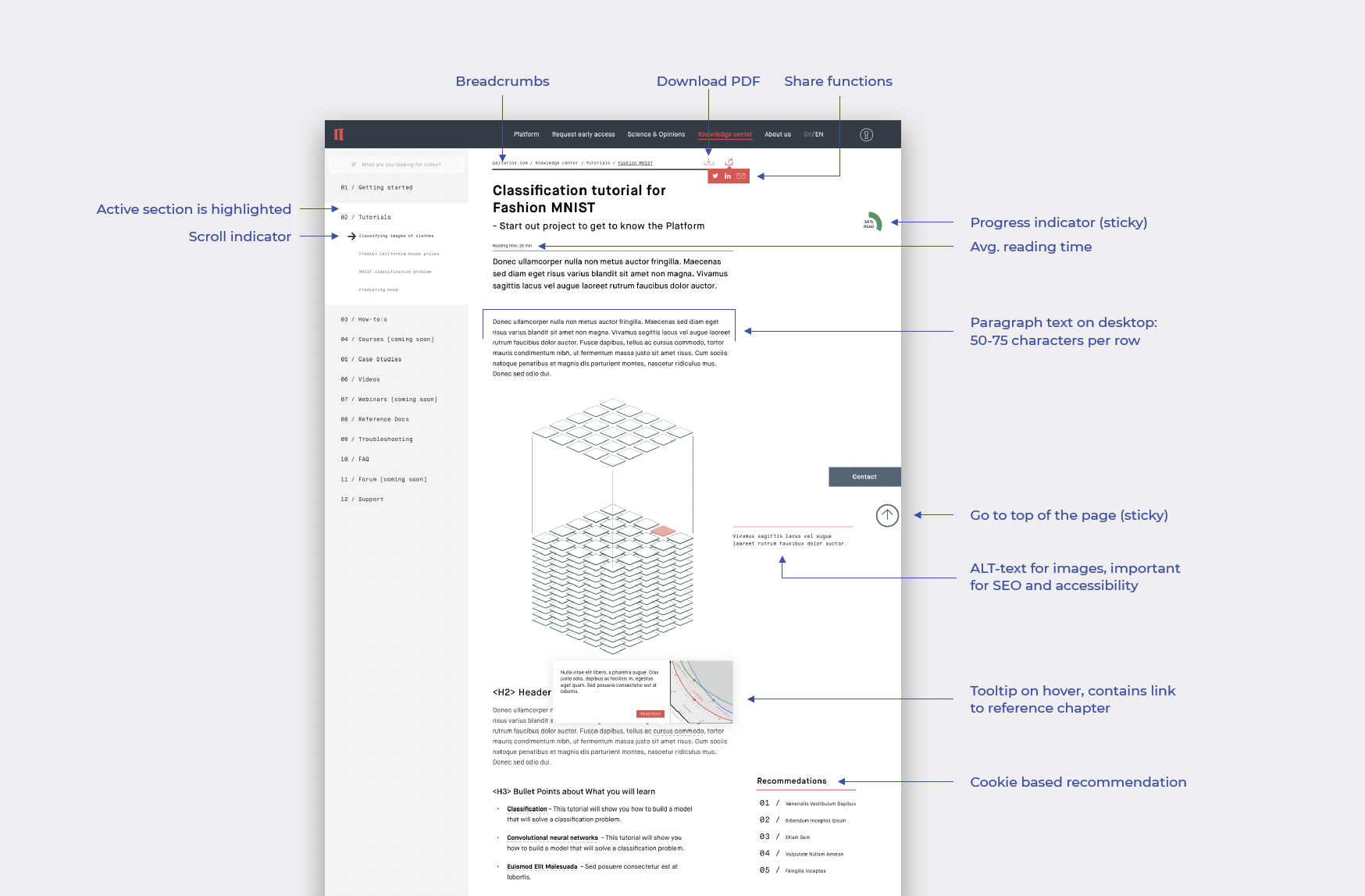

On desktop you can take advantage of the white space to the right of the text blocks, but be careful to not strain the users attention and create a cognitive overload of impressions. Note that some of these features was never implemented as they were out of scope for the first update.


